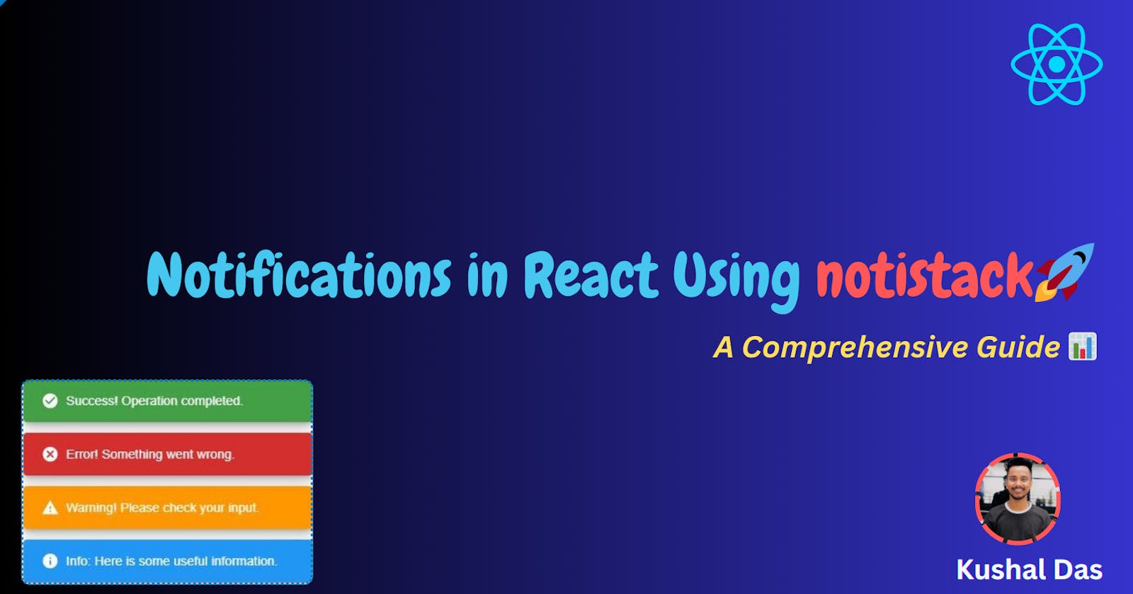
Enhancing User Experience with Notifications in React Using notistack
In this article, we'll use notistack in React for notifications: success, error, and warnings.
Introduction 📝
Notifications are a crucial aspect of user experience in modern web applications. They provide real-time feedback to users about their actions, inform them of important events, and help to guide their interaction with the application. In React applications, you can easily implement notifications using the notistack library, formerly known as react-notifications.
In this article, we'll explore how to use the notistack library to display various types of notifications in a React application, such as success messages, error alerts, and warnings.
Getting Started 🛠️
Before we dive into the code, let's start by setting up a new React project and installing the notistack library:
npx create-react-app notification-demo
cd notification-demo
npm install notistack
Now that we have our React project set up, let's proceed to implement notifications.
Initializing notistack 🚀
The notistack library provides a SnackbarProvider that needs to be wrapped around your application's root component. This provider sets up the context for managing notifications and should be placed in your index.js or App.js file:
// src/index.js

import React from 'react';
import ReactDOM from 'react-dom';
import { SnackbarProvider } from 'notistack';
import App from './App';

ReactDOM.render(
  <SnackbarProvider maxSnack={3}>
    <App />
  </SnackbarProvider>,
  document.getElementById('root')
);
Here maxSnack: This prop determines the maximum number of snackbars that can be concurrently displayed. When a new snackbar is triggered, and the maximum limit is reached, the library will automatically remove the oldest snackbar to make room for the new one.
For example, if
maxSnackis set to3, and you trigger four notifications in quick succession, only the latest three will be displayed, and the oldest one will be automatically removed.
Using enqueueSnackbar 📢
To display notifications, you need to access the enqueueSnackbar function provided by the SnackbarProvider. This function is typically used within your React components. Here's how you can access it:
import { useSnackbar } from 'notistack';

const MyComponent = () => {
  const { enqueueSnackbar } = useSnackbar();

  const showMessage = () => {
    enqueueSnackbar('This is a notification message.', { variant: 'success' });
  };

  return (
    <div>
      <button onClick={showMessage}>Show Notification</button>
    </div>
  );
};
In this example, we've imported the useSnackbar hook and destructured the enqueueSnackbar function from it. We then use this function to display a success notification when the button is clicked.
Output:

Types of Notifications 🔵
The notistack library supports different types of notifications, which can be specified using the variant option when calling enqueueSnackbar. Here are some common variants:
'success': Use for success messages.'error': Use for displaying error messages.'warning': Use to alert users about potential issues.'info': Use for informational messages.
Let's explore some examples of how to use these variants:
const MyComponent = () => {
  const { enqueueSnackbar } = useSnackbar();

  const showSuccess = () => {
    enqueueSnackbar('Success! Operation completed.', { variant: 'success' });
  };

  const showError = () => {
    enqueueSnackbar('Error! Something went wrong.', { variant: 'error' });
  };

  const showWarning = () => {
    enqueueSnackbar('Warning! Please check your input.', { variant: 'warning' });
  };

  const showInfo = () => {
    enqueueSnackbar('Info: Here is some useful information.', { variant: 'info' });
  };

  return (
    <div>
      <button onClick={showSuccess}>Show Success</button>
      <button onClick={showError}>Show Error</button>
      <button onClick={showWarning}>Show Warning</button>
      <button onClick={showInfo}>Show Info</button>
    </div>
  );
};
Output:

Customizing Notifications 🎨
The notistack library provides extensive customization options for notifications. You can control various aspects of the notification appearance and behavior, including the duration, position, and styling.
Here are some common customization options:
autoHideDuration: Specifies how long the notification should be displayed (in milliseconds).anchorOrigin: Sets the position where the notification appears (e.g., 'top-left', 'bottom-center').style: Allows you to define custom CSS styles for the notification.
Here's an example of customizing a notification:
const MyComponent = () => {
  const { enqueueSnackbar } = useSnackbar();

  const showCustomNotification = () => {
    enqueueSnackbar('Custom notification!', {
      variant: 'success',
      autoHideDuration: 3000, // 3 seconds
      anchorOrigin: {
        vertical: 'top',
        horizontal: 'right',
      },
      style: {
        backgroundColor: 'purple',
        color: 'white',
        fontWeight: 'bold',
      },
    });
  };

  return (
    <div>
      <button onClick={showCustomNotification}>Show Custom Notification</button>
    </div>
  );
};
Output:

It's always better to declare your
stylecomponent instyle.cssfile because when you are working on a big project and then let's say you are using awarningvariant so the color isorangeby default but if you want to customize it it's better to define your style inside the CSS file and then call in javascript by theclassName
Example :
/* Custom styles for the snackbar */
.custom-snackbar {
  background-color: purple !important;
  color: white !important;
  font-weight: bold !important;
}
The use of
!importantin CSS is a way to give a style declaration the highest specificity and here if any other color is present we make sure that going to override.
enqueueSnackbar('Custom Warning ', {
  variant: 'warning',
  autoHideDuration: 2000, // 2 seconds
  className: 'custom-snackbar', // Apply the custom class
});
Conclusion 🏁 🙌
Incorporating notifications into your React application using the notistack library enhances the user experience by providing timely feedback and information. Whether you need to display success messages, error alerts, warnings, or custom notifications, notistack offers a straightforward and customizable solution.
By following the steps outlined in this article, you can easily implement notifications in your React project and provide users with a more informative and engaging experience.
Thanks for reading all the way to the end! 💖
If you have any questions, please use the comments section 💬
Let's connect! Find me on the web 🔗
If you have any Queries or Suggestions, feel free to reach out to me.
Happy Coding :)❤️


